Table of Contents
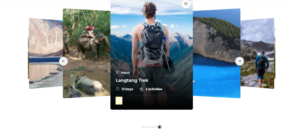
You can add a Trips Slider three widget via the Elementor plugin to showcase the trips on pages.
You can check the below instructions to configure the widget.
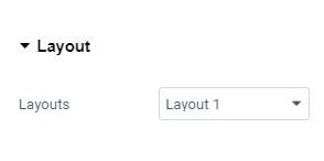
Layout Settings #
- Layout: Select from a variety of layout options to display trips. There are different layouts available, allowing you to customize the appearance of the Trip Slider three widget
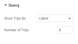
Query Settings #
- Show Trips by: Select how you would like to display trips. Options include showing the latest trips, trips on sale, featured trips, trips filtered by term, or selecting specific trips from a list
- Number of Trips: Specify the total number of trips you want to display.
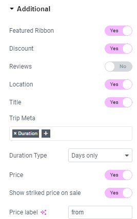
Additional Settings #
- Featured Ribbon: Enable to display a “featured” ribbon on trips.
- Discount: Enable to display the discount percentage.
- Review: Enable to display trip reviews.
- Location: Enable the toggle to display location of the trip.
- Title: Enable to display the trip titles.
- Title Meta: Add the title meta that you want to display in each trip.
- Price: Enable to display the trip prices.
- Show Striked Price on Sale: Enable to display the striked price for trips on sale.
- Duration Type: Choose to display the trip duration in days or nights.
- Price Label: Add the price label.
- Wishlist: Enable the toggle to display wishlist icon.
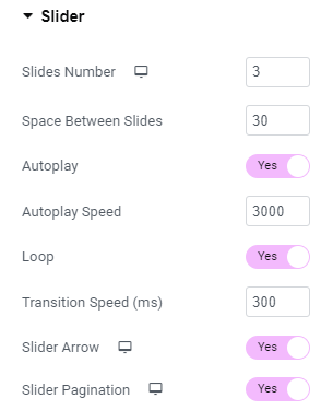
Slider Settings #
- Slider Number: Set the number of sliders to display at once.
- Space Between Slides: Define the spacing between each slide in pixels.
- Autoplay: Enable the transition between slides to be made automatically.
- Autoplay Speed: Set the time between each slide transition in milliseconds.
- Loop: Enable the toggle to continuously cycle slides after the last one.
- Transition Speed: Adjust the speed of slide transitions in milliseconds.
- Slider Arrow: Enable the toggle to show navigation arrows.
- Slider Pagination: Enable dots for navigating between slides.
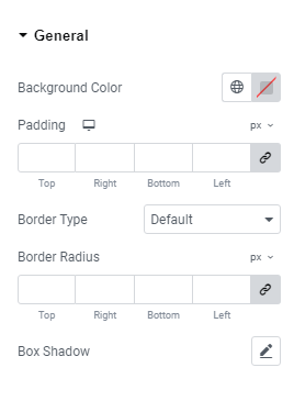
General Settings #
- Background Color: Choose the background color for the widget section.
- Padding: Adjust the padding around the content within the widget section.
- Border Radius: Set the border radius to control the roundness of the corners.
- Border Type: Choose the border type for the widget section.
- Box Shadow: Configure the box shadow effect for the post boxes within the widget section.
Content #
- Alignment: Align the widget section as desired.
- Background Color: Choose the background color for the widget section.
- Padding: Adjust the padding around the content within the widget section.
- Border Type: Select the border type for the widget section.
- Box Shadow: Configure the box shadow for the post boxes within the widget section.
- Border Radius: Set the border radius to control the roundness of the corners.
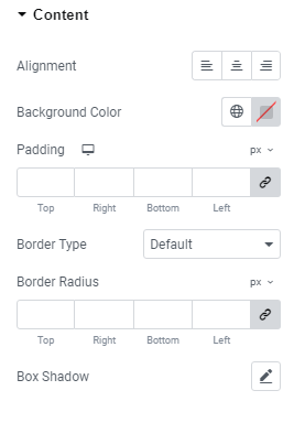
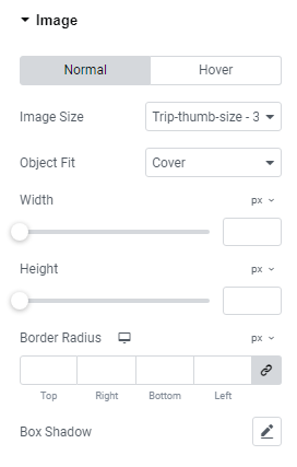
Image #
- Image Size: Select the aspect ratio for the featured image of the trips for both normal and hover modes.
- Object Fit: Choose the object fit for the trip’s featured image in both normal and hover modes.
- Width: Specify the width of the image for both normal and hover modes.
- Height: Specify the height of the image for both normal and hover modes.
- Border Radius: Define the border radius for the images in both normal and hover modes.
- Box Shadow: Configure the box shadow for the featured image in both normal and hover modes.
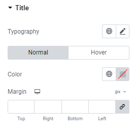
Title #
- Typography: Choose and configure the typography for the post titles.
- Color: Set the color of the trip titles displayed in this widget for both normal and hover mode.
- Margin: Set a margin around the title of the trips for both normal and hover mode.
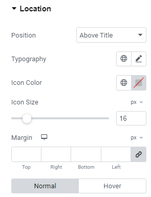
Location #
- Position: Set the position of the trip location.
- Typography: Configure the typography for the trip location.
- Icon Color: Choose the color for the location icon.
- Icon Size: Set the size of the location icon.
- Margin: Adjust the margin around the location.
- Text Color: Specify the text color for the trip location for both hover and normal mode.
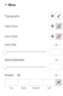
Metas #
- Typography: Select typography for the Trips Metas.
- Text Color: Set the text color of Trips Metas.
- Icon Size: Select the size of the Metas icons.
- Icon Color: Choose the color for the icons in Trips Metas.
- Space Between: Adjust the space between the Trips Metas.
- Margin: Set a margin around the Trips Metas.
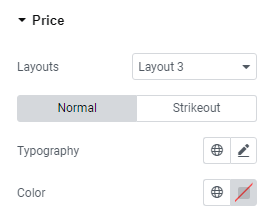
Price #
- Layouts: Select a layout to display the price tag; three options are available.
- Typography: Set the typography for both the normal and strikeout prices.
- Color: Choose the color for both the normal and strikeout prices.
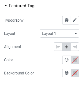
Featured Tag #
- Typography: Set the typography for the featured tag.
- Layout: Select a layout to display the featured tag.
- Alignment: Choose the alignment for displaying the featured tag.
- Color: Choose the color for the featured tag.
- Background Color: Select a background color for the featured tag.
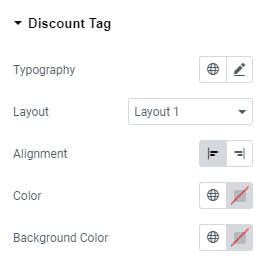
Discount Tag #
- Typography: Set the typography for the discount tag.
- Layout: Select a layout to display the discount tag.
- Alignment: Choose the alignment for displaying the discount tag.
- Color: Choose the color for the discount tag.
- Background Color: Select a background color for the discount tag.
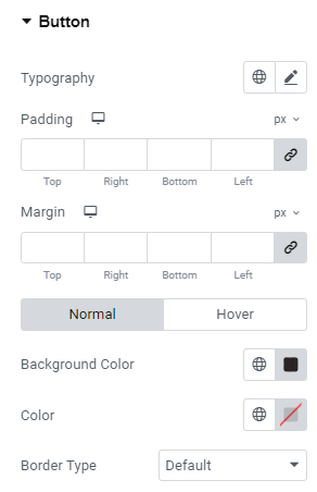
Button #
- Typography: Configure the typography settings for the “View Detail” button, including font style, size, and weight.
- Padding: Set the padding around the button to adjust the spacing between the button content and its borders.
- Margin: Define the margin around the button to control the space between the button and other elements.
- Background Color: Customize the background color of the button for both normal and hover states.
- Text Color: Set the text color of the button for both normal and hover states.
- Border Type: Choose the type of border for the button (e.g., solid, dashed, or none)for both normal and hover states.
- Border Radius: Adjust the border radius to create rounded corners on the button for both normal and hover states.
- Box Shadow: Apply a shadow effect to the button for a more dynamic look for normal and hover states.
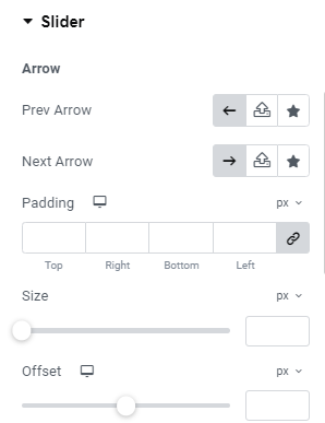
Slider #
- Prev Arrow: Choose an SVG for the previous arrow.
- Next Arrow: Choose an SVG for the next arrow.
- Padding: Add space around the slider arrow.
- Size: Select the size of the arrow.
- Offset: Set the offset distance for the arrow.
- Background Color: Select the arrow background color for both normal and hover states.
- Color: Choose the arrow color for both normal and hover states.
- Border Type: Select the border style for the arrow.
- Border Radius: Adjust the border radius for rounded arrow corners.
- Box Shadow: Add shadow effects around the arrow.
- Color (Pagination): Choose the pagination dot color of the slider.
- Active Color (Pagination): Select the active pagination dot color.
- Spacing (Pagination): Adjust the spacing between pagination dots.