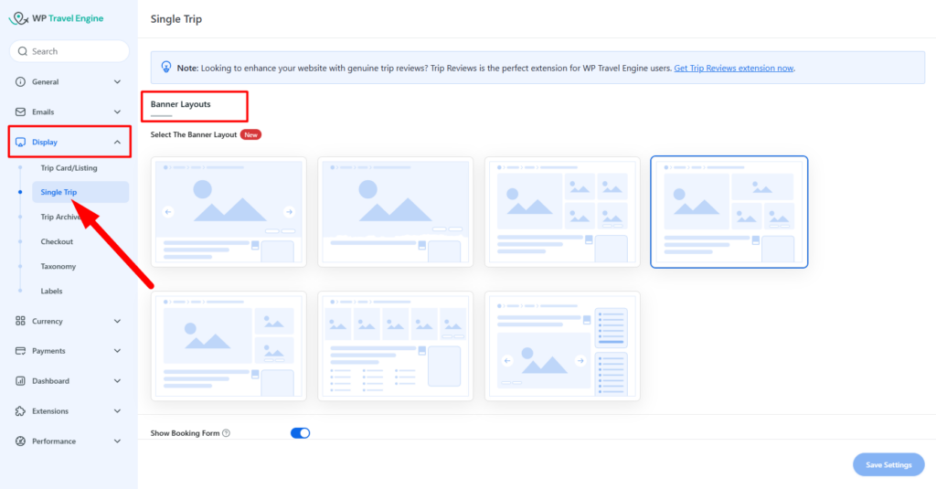
To change the banner layout in single trip page, please navigate via Admin Dashboard > WP Travel Engine > Settings > Display > Single Trip.
Under the Banner Layouts option, you can select one of the seven available layouts.
Below are the description and preview of each banner layouts:
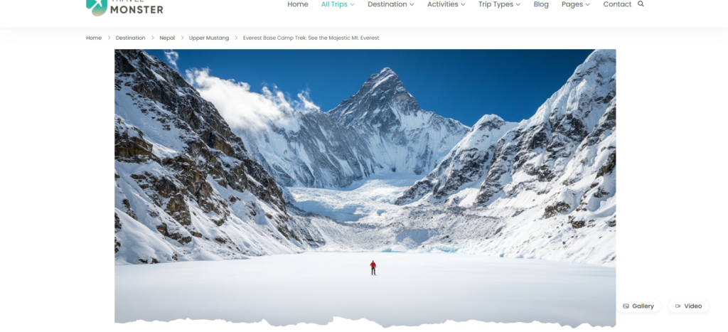
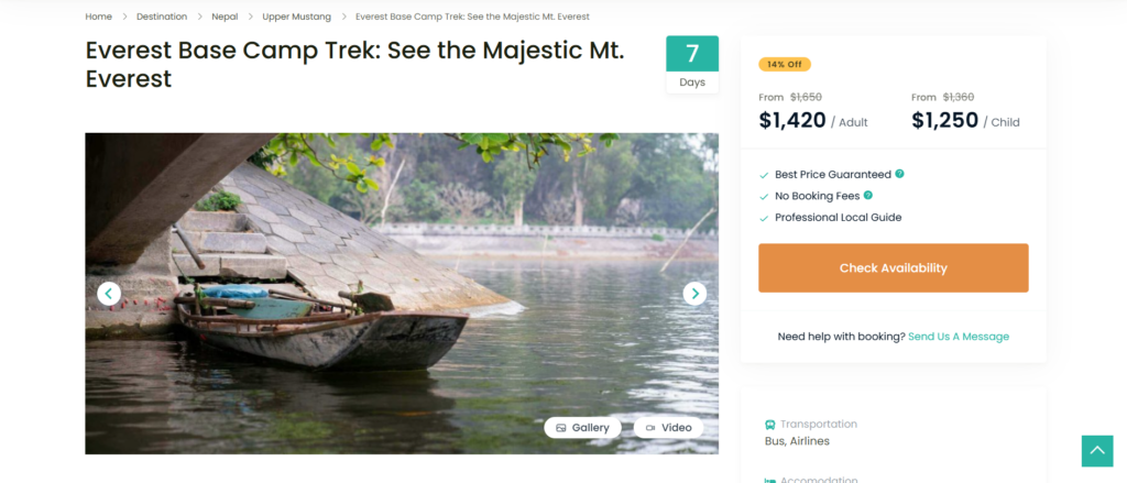
a. Banner Layout 1 #
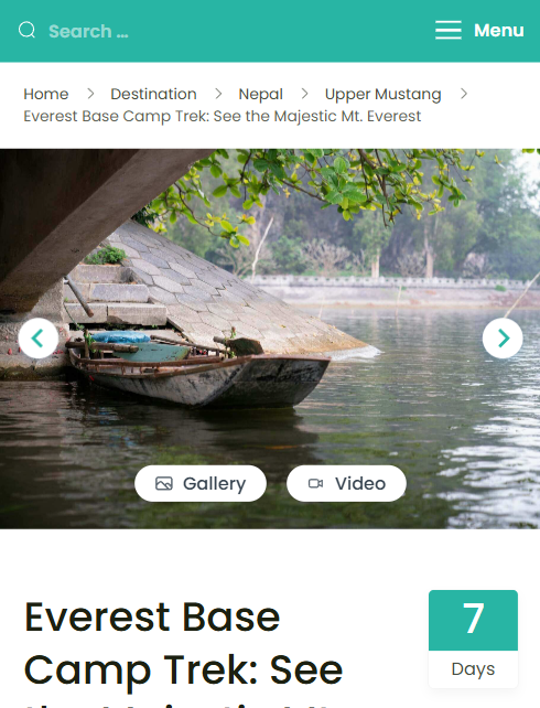
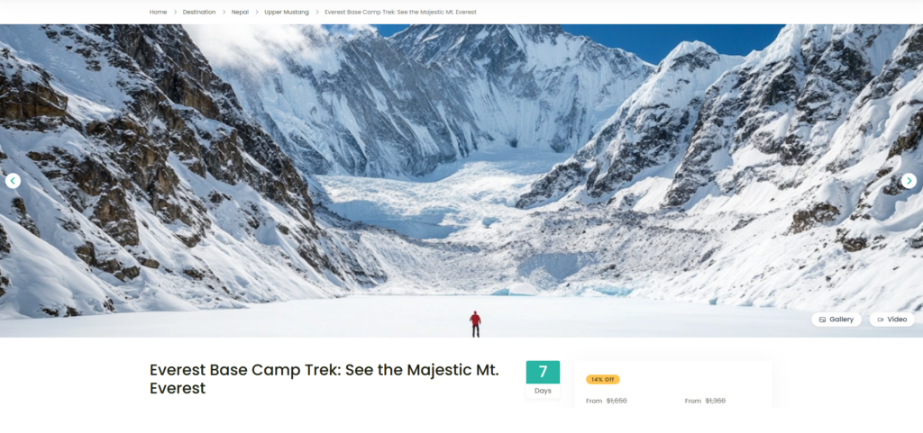
Layout 1 displays full-width image slider with navigation arrows. This layout allows users to browse through gallery images using the slider or navigation arrows. Additionally, users can view full-sized images by clicking the “Gallery” button located at the bottom-right corner, which opens the images in a Lightbox modal.
Recommended Image Size: 1920 by 800 pixels for optimal display.
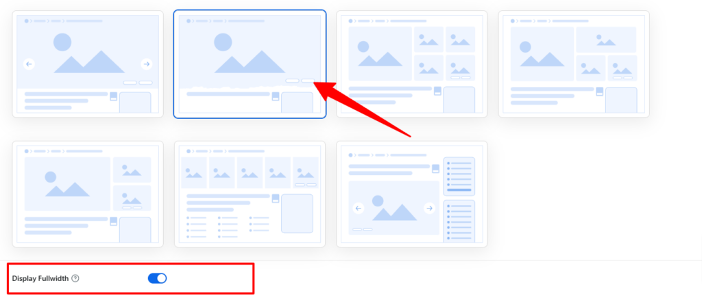
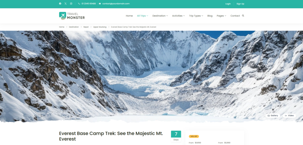
b. Banner Layout 2 #
Layout 2 isplays the original image by default. If a full-width banner is preferred, you can enable the Display Fullwidth option for this layout.
Below is a screenshot showing the banner when Layout 2 is selected:
Below is another screenshot showing the banner when Layout 2 is selected with Display Fullwidth option enabled:
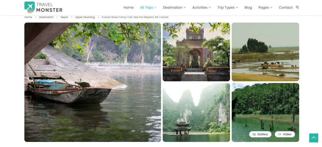
c. Banner Layout 3 #
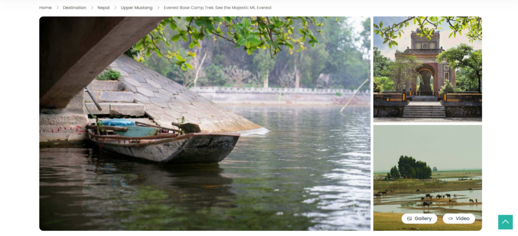
Layout 3 utilizes a split-screen design that balances visual content and information effectively. The left section displays a large, featured image in its 324/284 aspect ratio, while the right section showcases a grid of smaller supporting images. These smaller images are ideal for highlighting trip details, destinations, or additional visuals.
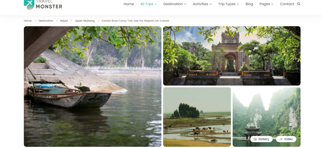
d. Banner Layout 4 #
Layout 4 is same as the Layout 3 but the it incudes a single image in the upper side instead of 2 supporting images on the right section.
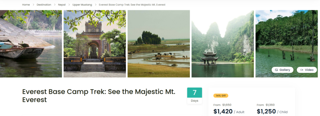
e. Banner Layout 5 #
Layout 5 incudes a large featured image in the left section with 2 other supporting images in right section.
f. Banner Layout 6 #
Layout 6 features features five images displayed side by side in a static grid format. When users hover over an image, it zooms in, creating a subtle and engaging hover effect.
g. Banner Layout 7 #
Layout 7 features a image slider and will be displayed below the trip title within the trip content area unlike other banner layouts which are displayed outside the trip content area.
Additional Notes: #
The banner layouts are specifically designed for desktops and tablets. On mobile devices, a standard image slider will replace all banner layouts to ensure optimal functionality and responsiveness.