Overview #
The WPTE Builder allows you to create fully customizable Mobile Menus and Off Canvas panels using Elementor.
These features help you design modern, responsive navigation and slide-in content areas tailored for mobile and desktop users.
Prerequisites #
Before using these features, make sure:
- The latest version of the Travel Monster theme is installed and activated
- The Elementor plugin is installed and activated
- The WTE Elementor plugin is installed and activated
Mobile Menu Builder #
The Mobile Menu Builder lets you create a custom mobile header layout instead of using the default theme mobile menu.
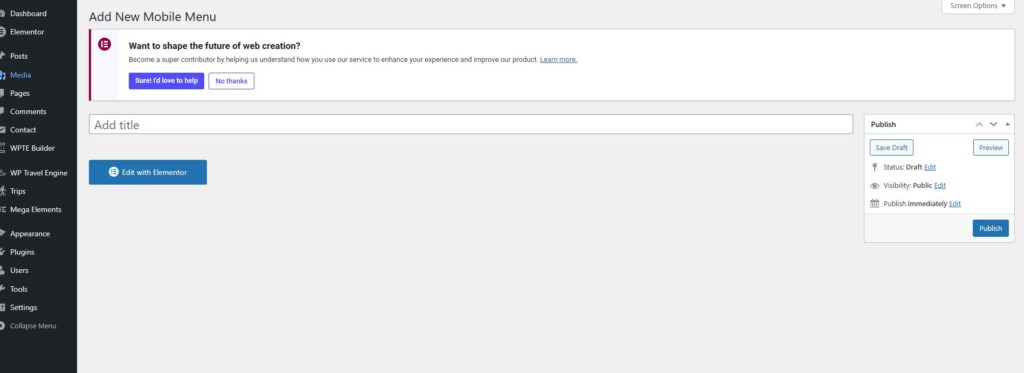
Step 1: Create a Mobile Menu #
- Go to WPTE Builder > Mobile Menu
- Click Add New
- Enter a name for your mobile menu
- Click Publish
Step 2: Edit with Elementor #
- Click Edit with Elementor
- This will launch the Elementor editor, where you can start designing your mobile menu using drag-and-drop widgets.
Recommended Widgets #
- Navigation Menu – Display your menu
- Site Logo – Add your branding
- Off Canvas – Add a toggle for slide-in menu
- Search – Add search functionality
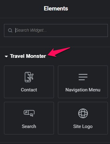
ℹ️ You can also use any other Elementor widget to add buttons, social icons, announcements, or promotional messages.
Step 3: Apply the Mobile Menu #
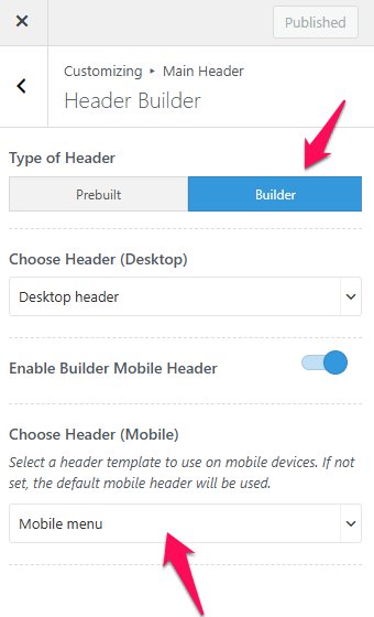
Once you’re done designing, the custom header will automatically apply if you’ve selected “Builder” as the layout option in the Customizer Settings:
- Navigate to Appearance > Customize > Main Header > Header Builder
- Under Type of Header, select Builder
- You can select the header that you have created
Off Canvas Builder #
The Off Canvas Builder allows you to create reusable slide-in panels such as mobile menus, sidebars, or contact panels.
How It Works #
It follows a two-step system:
- Create the panel layout in Off Canvas Builder
- Display it using the Off Canvas widget
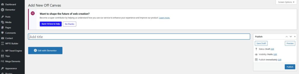
Step 1: Create an Off Canvas Template #
- Go to WPTE Builder > Off Canvas Builder
- Click Add New
- Enter a template name (e.g., Mobile Menu Panel)
- Publish
- Click Edit with Elementor
- Design your panel layout using widgets:
- Navigation Menu
- Logo
- Social Icons
- Contact Info
- Click Publish
ℹ️ Only published templates will be available for selection.
Content Settings #
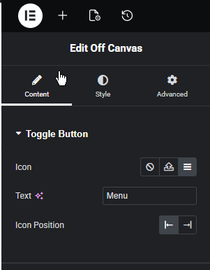
Toggle Button #
- Icon: Select a menu icon (default: hamburger)
- Text: Optional label
- Icon Position: Before or after text
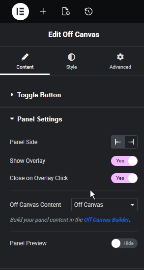
Panel Settings #
- Panel Side: Left or Right
- Show Overlay: Enable background overlay
- Close on Overlay Click: Enable/disable closing on click
- Off Canvas Content: Select your template
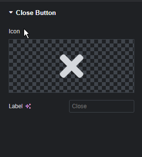
Close Button #
- Icon: Close icon (default: X)
- Label: Optional text
Feel free to contact our support team for any other assistance.