Table of Contents
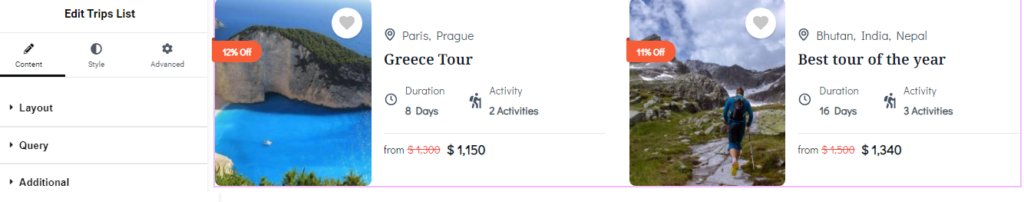
You can add Trips List widget via Elementor plugin to show case the trips on pages.
Below are the settings you can configure to set up the Trips List Widget:
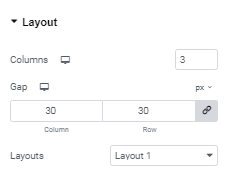
Layout Settings #
- Column: Choose number of trips that you want to display per row.
- Gap: Set the spacing between the rows and columns of trips.
- Layout: Select from a variety of layout options to display trips. There are three different layouts available, allowing you to customize the appearance of the advanced trips display.
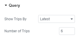
Query Settings #
- Show Trips by: Select how you would like to display trips. Options include showing the latest trips, trips on sale, featured trips, trips filtered by term, or selecting specific trips from a list
- Number of Trips: Specify the total number of trips you want to display.
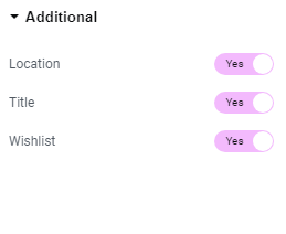
Additional Settings #
- Location: Enable the toggle to display location of trips.
- Title: Enable the toggle to display the title of trips.
- Wishlist: Enable the toggle display the wishlist icon.
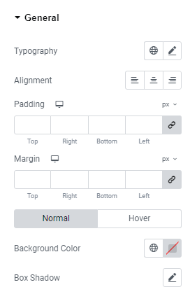
General Settings #
- Typography: Configure the typography for the widget section.
- Padding: Adjust the padding around the content within the widget section
- Margin: Set the margin for the widget section.
- Alignment: Align the widget section as desired.
- Background Color: Choose the background color for the widget section.
- Box Shadow: Configure the box shadow effect for the post boxes within the widget section.
- Border Type: Select the border type for the widget section, applicable for both normal and hover states.
- Border Radius: Set the border radius to control the roundness of the corners, applicable for both normal and hover states.
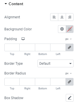
Content #
- Alignment: Align the widget section as desired.
- Background Color: Choose the background color for the widget section.
- Padding: Adjust the padding around the content within the widget section.
- Border Type: Select the border type for the widget section.
- Box Shadow: Configure the box shadow for the post boxes within the widget section.
- Border Radius: Set the border radius to control the roundness of the corners.
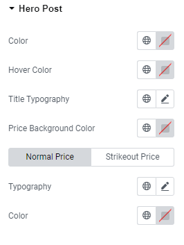
Hero Post #
- Color: Choose the color for the Hero post.
- Hover Color: Select the hover color for the Hero post.
- Title Typography: Customize the typography for the Hero post title.
- Price Background Color: Define the background color for the price.
- Typography: Configure the typography for both the Normal Price and Strikeout Price.
- Color: Set the color for the Normal Price and Strikeout Price.
Title #
- Typography: Choose and configure the typography for the post titles.
- Color: Set the color of the trip titles displayed in this widget for both normal and hover mode.
- Padding: Set the padding around the Title of trips for both normal and hover mode.
- Margin: Set a margin around the title of the trips for both normal and hover mode.
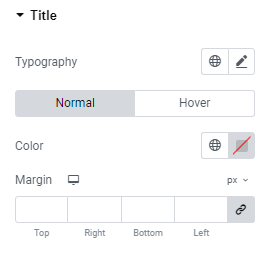
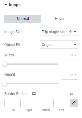
Image #
- Image Size: Select the aspect ratio for the featured image of the trips for both normal and hover modes.
- Object Fit: Choose the object fit for the trip’s featured image in both normal and hover modes.
- Width: Specify the width of the image for both normal and hover modes.
- Height: Specify the height of the image for both normal and hover modes.
- Border Radius: Define the border radius for the images in both normal and hover modes.
- Box Shadow: Configure the box shadow of featured images of trips.
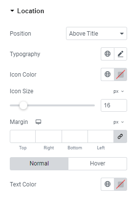
Location #
- Position: Set the position of the trip location.
- Typography: Configure the typography for the trip location.
- Icon Color: Choose the color for the location icon.
- Icon Size: Set the size of the location icon.
- Margin: Adjust the margin around the location.
- Text Color: Specify the text color for the trip location.