Table of Contents
You can add a Destination/Activities 2 widget via the Elementor plugin to showcase the Destination, Activity, and Trip Types on pages.

Below are the settings you can configure to set up the Destination/Activities 2 Widget:
Layout Settings #
- Column: Choose number of columns that you want to display.
- Gap: Set the spacing between the rows and columns of the taxonomy box.
- Layouts: Select from a variety of layout options to display trips. There are three different layouts available, allowing you to customize the appearance of the widget.

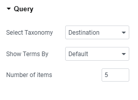
Query Settings #
- Select Taxonomy: Select whether you want to display Destination, Activities, or Trips Types.
- Show Term by: Select how you would like to display taxonomy. Options include showing the taxonomy by default or choosing from the list.
- Number of Items: Specify the total number of items you want to display.
Additional Settings #
- Title Tag: Select the header tag you would like to use for displaying the taxonomy title.
- Show Trip Counts: Enable this toggle to display the number of trips linked to the taxonomy.
- Trip Count Label: Enter a label to display next to the trip count associated with the taxonomy.
- Show view more button: Enable the toggle to display view more button.

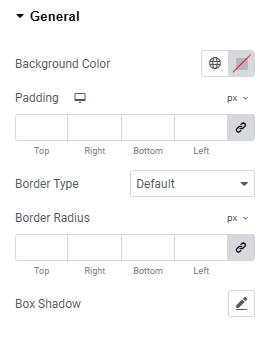
General Settings #
- Background Color: Choose a background color for the widget section.
- Padding: Adjust the padding around the content within the widget section.
- Border Radius: Set the border radius to control the roundness of the corners.
- Border Type: Select the border type for the widget section.
- Box Shadow: Configure the box shadow effect for the post boxes within the widget section.
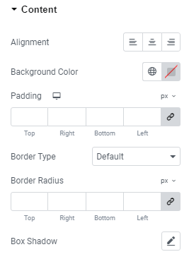
Content #
- Alignment: Align the widget section as desired.
- Background Color: Choose the background color for the widget section.
- Padding: Adjust the padding around the content within the widget section.
- Border Type: Select the border type for the widget section.
- Box Shadow: Configure the box shadow for the taxonomy boxes within the widget section.
- Border Radius: Set the border radius to control the roundness of the corners.
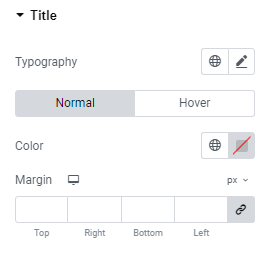
Title #
- Typography: Choose and configure the typography for the taxonomy titles.
- Color: Set the color of the taxonomy titles displayed in this widget for both normal and hover mode.
- Margin: Set a margin around the title of the taxonomies for both normal and hover modes.
Count #
- Typography: Select and customize the typography for the count number.
- Color: Choose the color for the count number.
- Margin: Adjust the margin around the count number.
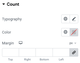
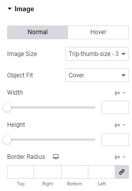
Image #
- Image Size: Select the aspect ratio for the featured image of the trips for both normal and hover modes.
- Object Fit: Choose the object fit for the trip’s featured image in both normal and hover modes.
- Width: Specify the width of the image for both normal and hover modes.
- Height: Specify the height of the image for both normal and hover modes.
- Border Radius: Define the border radius for the images in both normal and hover modes.
Button #
- Padding: Set padding within the arrow button.
- Margin: Adjust the margin around the arrow button.
- Background Color: Select a background color for the button for both normal and hover states.
- Color: Choose the arrow color for both normal and hover states.
- Border Type: Specify the border style for the button for both normal and hover states.
- Border Radius: Set the border radius for the button for both normal and hover states.
- Box Shadow: Customize the box shadow for the button for both normal and hover states.
