Table of Contents
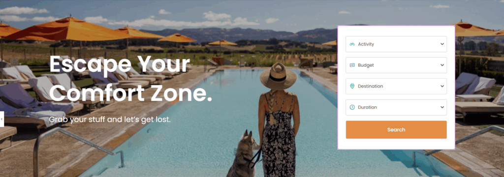
You can add the Trip Search Widget using the Elementor plugin. This widget allows visitors to easily search and filter trips on your travel website.
Follow the instructions below to configure each setting.
Layout Settings #
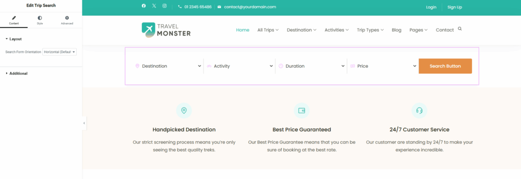
- Horizontal: Displays all fields arranged side-by-side in a single row.
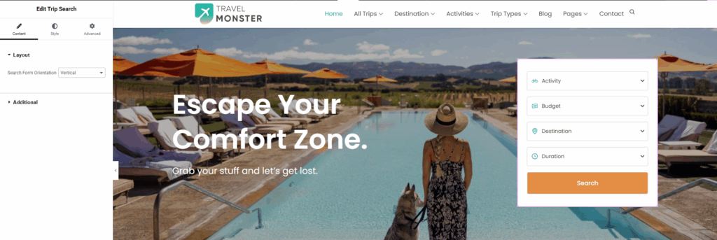
- Vertical: Displays all fields arranged one below the other in a single column.
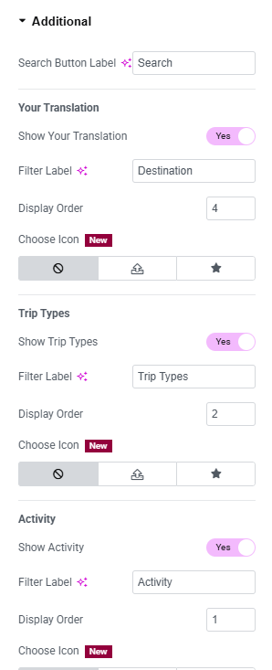
Additional Settings #
These settings allow you to further customize how the Trip Search Widget looks and behaves, making it easier for users to find the trips they’re searching for.
Search Button Label: #
- Customize the text displayed on the search button to match your site’s tone (e.g., “Find Trips,” “Search Now,” etc.).
Destination: #
- Show Destination: Enable this option to customize the destination label according to your preference.
- Filter Label: Allows you to change the label displayed for the filter.
- Display Order: Lets you customize the order in which destinations appear.
- Choose Icon: Allows you to upload an SVG or select an icon from the icon library.
Trip Types #
- Show Trip Types: Enable this option to customize and display the trip types according to your preference.
- Filter Label: Allows you to change the label displayed for the filter.
- Display Order: Lets you customize the order in which destinations appear.
- Choose Icon: Allows you to upload an SVG or select an icon from the icon library.
Activity #
- Show Activity: Enable this option to customize and display activities according to your preference.
- Filter Label: Allows you to change the label displayed for the filter.
- Display Order: Lets you customize the order in which destinations appear.
- Choose Icon: Allows you to upload an SVG or select an icon from the icon library.
Duration #
- Show Duration: Enable this option to customize the Duration according to your preference.
- Filter Label: Allows you to change the label displayed for the filter.
- Display Order: Lets you customize the order in which destinations appear.
- Choose Icon: Allows you to upload an SVG or select an icon from the icon library.
Price #
- Show Price: Enable this option to customize the Price Label according to your preference.
- Filter Label: Allows you to change the label displayed for the filter.
- Display Order: Lets you customize the order in which destinations appear.
- Choose Icon: Allows you to upload an SVG or select an icon from the icon library.
Date: #
- Show Date: Enable this option to customize the Date Label according to your preference.
- Filter Label: Allows you to change the Date label displayed for the filter.
- Display Order: Lets you customize the Date order in which destinations appear.
- Choose Icon: Allows you to upload an SVG or select an icon from the icon library for the Date Label.
General Settings: #
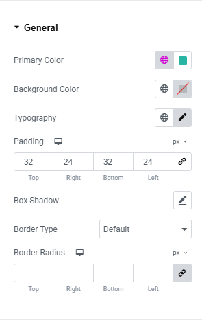
- Primary Color: Set the main color for the section.
- Background Color: Choose the background color for the section.
- Typography: Customize fonts, sizes, and styles.
- Padding: Adjust the spacing inside the section.
- Box Shadow: Add or modify shadow effects around the section.
- Border Type: Select the type of border (solid, dashed, etc.).
- Border Radius: Control the roundness of the section’s corners.
Input: #
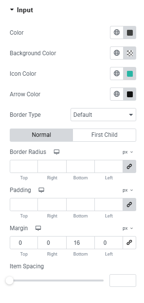
- Input Color: Set the color of input text or fields.
- Background Color: Choose the background color for the item/element.
- Icon Color: Customize the color of icons.
- Arrow Color: Set the color of arrows (e.g., dropdown arrows).
- Border Type: Select the type of border (solid, dashed, etc.).
- Border Radius: Adjust the roundness of corners.
- Padding: Set the inner spacing within the item.
- Margin: Define the outer spacing around the item.
- Item Spacing: Control the space between multiple items or elements.
Button: #
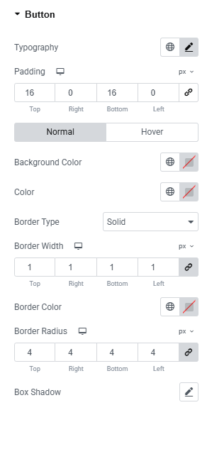
- Typography: Set the font family, size, weight, and style for the button text.
- Padding: Adjust the inner spacing inside the button.
- Normal/Hover States: Customize button appearance separately for normal and hover states.
- Background Color: Choose the background color for the button.
- Text Color: Set the color of the button text.
- Border Type: Select the type of border (solid, dashed, dotted, etc.).
- Border Width: Define the thickness of the button border.
- Border Color: Set the color of the border.
- Border Radius: Adjust the roundness of the button corners.
- Box Shadow: Apply shadow effects to create depth for the button.
Feel free to contact our support team for any other assistance.